Technical Indicator

Understanding Market Profile: A Trader's Guide to Analyzing Market Movements
MetaTrader4
Understanding Market Profile: A Trader's Guide to Analyzing Market Movements

The Market Profile is a powerful tool for traders, developed by the insightful Peter Steidlmayer. He found a way to visualize market activity through volume, represented as a bell-shaped curve. This unique perspective allows traders to interpret the objective information generated by the market effectively.Market Profile offers an alternative way to present both horizontal and vertical market movements, resulting in a completely different set of models. When you look at the chart, you'll notice how it depicts an equilibrium market as a bell-shaped curve that’s rotated 90 degrees due to the orientation of the diagram.Instead of simply charting each time segment as a bar, Market Profile positions each segment in a specialized manner. For instance, take a look at how a standard 30-minute bar chart can be transformed into a Market Profile:A long profile indicates that the price has remained stable for an extended period. This stability occurs when the market is in relative equilibrium, suggesting that, over time, there were numerous opportunities at a specific price level. Conversely, a short profile points to a swift move to a new price level, which typically happens when the market is out of equilibrium.The outline of the profile reveals the relationship between vertical and horizontal movements, serving as a key to understanding trader behavior. The Market Profile not only indicates when the market is likely to shift from equilibrium to disequilibrium but also how significant that movement could be.Key ParametersSTEP: This represents the vertical step in points.

2006.10.16
Understanding Three-Line Break Charts: A Trader's Guide
MetaTrader4
Understanding Three-Line Break Charts: A Trader's Guide

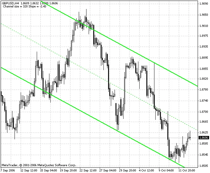
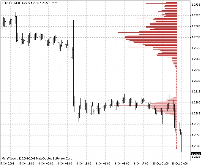
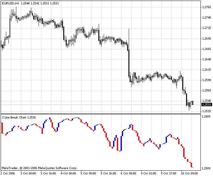
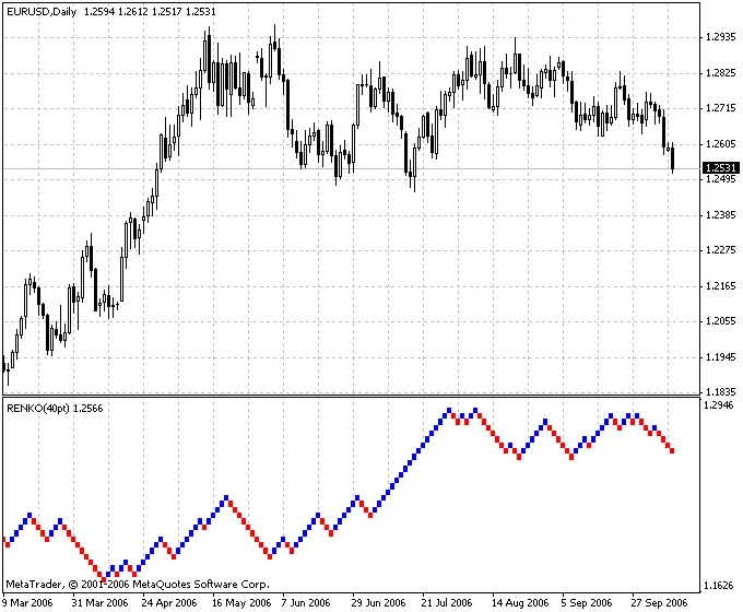
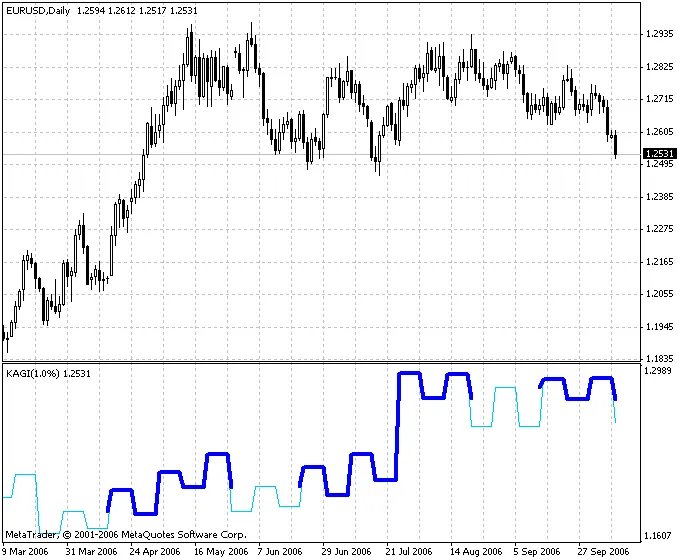
Three-line break charts are an interesting tool in the trader's toolkit, offering a unique perspective on price movements. Unlike traditional charts, which factor in time, these charts present a straightforward visualization of price changes through vertical rectangles. The height of each rectangle corresponds to the magnitude of price fluctuations. This method of charting is similar to Kagi, Point & Figure (P&F), and Renko charts, focusing solely on price action.Originally popularized in the United States by Steven Nison in his book Beyond Candlesticks, three-line break charts have become a staple for many traders. Let's dive into the basics of how to trade using this method:Buy Signal: When you spot three consecutive red lines followed by a blue line (the 'blue reversal line'), it's time to consider buying.Sell Signal: Conversely, if you see three blue lines followed by a red line (the 'red reversal line'), that’s your cue to sell.No Trading Zone: Avoid trading when the lines alternate between blue and red without forming a stable trend.One of the significant advantages of three-line break charts is that the reversal criteria are not arbitrarily set. Instead, they are dictated by price dynamics. However, a downside is that reversal signals may appear only after a new trend has already formed, meaning some traders might miss the initial move. That said, many traders are willing to wait for a more reliable confirmation to capitalize on larger trends.For those looking to adjust their trading approach, the sensitivity of reversal signals can be modified by changing the number of lines used to indicate a break. Short-term traders might prefer a two-line break for more frequent signals, while long-term investors might opt for four or even ten-line breaks to reduce signal noise. In Japan, the three-line break method is particularly popular among traders.As recommended by S. Nison, combining three-line break charts with candlestick analysis can enhance your trading strategy. By using three-line breaks to identify the primary trend direction, you can pinpoint optimal entry and exit points for your trades.Parameters:LB - count of break lines

2006.10.16
Understanding Renko Charts: A Trader's Guide
MetaTrader4
Understanding Renko Charts: A Trader's Guide

When it comes to charting methods, Renko charts stand out for their unique approach. The name 'Renko' actually comes from the Japanese word 'renga,' meaning bricks. Just like their name suggests, Renko charts are constructed using bricks that only appear when prices move by a certain amount, known as the box size. For instance, if you're using a 5-unit Renko chart, a 20-point price increase will be represented by four bricks, each 5 units tall. This method creates a clean visual representation that makes it easier to spot trends without the noise of minor price fluctuations. Renko charts were introduced to traders in the US by Steven Nison through his insightful book, Beyond Candlesticks. Since then, they’ve gained popularity among traders looking for effective trend analysis tools. Identifying Trends with Renko Charts One of the most appealing aspects of Renko charts is their ability to signal trend reversals. A new blue brick indicates the start of an uptrend, while a red brick suggests a downtrend. However, keep in mind that, like any trend-following technique, Renko charts can occasionally produce whipsaws—false signals that appear at the tail end of fleeting trends. Nonetheless, the goal with this method is to capture the bulk of significant price movements. Renko charts excel at isolating underlying price trends, which can be particularly useful for pinpointing support and resistance levels. By filtering out the minor fluctuations, they help traders focus on the bigger picture. Parameters to Consider Box Size: This parameter determines how much price movement is needed to create a new brick.

2006.10.16
Understanding Kagi Charts: A Trader's Guide
MetaTrader4
Understanding Kagi Charts: A Trader's Guide

Kagi Charts have their roots in the 1970s during the early days of the Japanese stock market. These charts are unique in that they consist of a series of interconnected vertical lines, with their thickness and direction determined solely by price movements, rather than time. When prices move consistently in one direction, the vertical line on the chart extends longer. However, if the price reverses by a predetermined value (known as the reverse coefficient), a new vertical line will be drawn in a new column. The thickness of the Kagi lines adjusts when prices break through previous highs or lows. Kagi Charts gained popularity in the U.S. largely thanks to Steve Nison’s influential book, Beyond Candlesticks. These charts are excellent at illustrating the tug-of-war between supply and demand. A series of thick lines indicates that demand is outpacing supply, signaling a bullish market. Conversely, a series of thin lines suggests that supply exceeds demand, indicating a bearish trend. When thick and thin lines alternate, it reflects a market in balance. The primary trading signal derived from Kagi Charts relates to line thickness: if a thin line turns thick, it’s a signal to buy; if a thick line turns thin, it’s time to sell. Additionally, if you observe a series of rising highs and lows, it reflects a strong upward trend, while decreasing highs and lows indicate a weakening market. Parameters: Porog - reversing coefficient in percentages

2006.10.16
Mastering the BB MACD Indicator: A Trader's Guide
MetaTrader4
Mastering the BB MACD Indicator: A Trader's Guide

Understanding the BB MACD Indicator The BB MACD indicator is a powerful tool that combines the Bollinger Bands (BB) and the Moving Average Convergence Divergence (MACD) to help traders identify potential trends and reversals in the market. This indicator can provide crucial insights into price movements, making it a favorite among both novice and seasoned traders. Let’s take a closer look at how the BB MACD works and how you can leverage it in your trading strategy. Key Components of the BB MACD Bollinger Bands: These bands consist of a middle line (the moving average) and two outer lines that represent standard deviations from that average. They help in identifying volatility and potential price reversals. MACD: This indicator shows the relationship between two moving averages of a security’s price. It helps in identifying the momentum of the market. How to Use the BB MACD in Trading Here are some practical tips for using the BB MACD indicator effectively: Identify Trends: When the price is consistently touching the upper or lower Bollinger Bands, it indicates a strong trend. Use the MACD to confirm the momentum. Look for Divergences: If the price makes a new high or low that isn’t confirmed by the MACD, it may signal a reversal. Combine with Other Indicators: Enhance your trading decisions by combining the BB MACD with other indicators to increase accuracy. In conclusion, the BB MACD is a versatile tool that can provide valuable insights into market trends and potential trading opportunities. By understanding how to interpret its signals, you can enhance your trading strategy and make more informed decisions.

2006.08.10
Understanding the ATR Ratio: A Trader's Guide to Market Volatility
MetaTrader4
Understanding the ATR Ratio: A Trader's Guide to Market Volatility

The ATR ratio is a powerful tool that many traders rely on to gauge market volatility. If you're looking to sharpen your trading strategy, understanding this indicator is key.In this post, we'll break down what the ATR ratio is and how you can use it effectively in your trading.What is the ATR Ratio?The Average True Range (ATR) ratio helps traders measure market volatility by calculating the average range between high and low prices over a specific period. It’s a handy indicator, especially in fast-moving markets, as it allows you to adjust your trading strategies according to market conditions.Why Use the ATR Ratio?Risk Management: Knowing the volatility can help you set better stop-loss orders.Entry and Exit Points: Use the ATR to identify optimal entry and exit points based on current market conditions.Market Sentiment: The ATR can provide insights into market sentiment, helping you make informed decisions.How to Use the ATR Ratio in Your TradingTo effectively incorporate the ATR ratio into your trading, consider the following steps:Calculate the ATR for the asset you are interested in trading.Use the ATR value to determine your position sizing and stop-loss levels.Monitor changes in the ATR to adapt your strategy as market conditions evolve.In conclusion, mastering the ATR ratio can significantly enhance your trading performance. Keep an eye on this indicator, and you'll be better equipped to navigate the ups and downs of the market.

2006.08.09
First Previous 390 391 392 393 394 395 396 397 398 399 400 Next Last