Technical Indicator

Unlocking the Waddah Attar Hidden Level: A Trader’s Guide
MetaTrader4
Unlocking the Waddah Attar Hidden Level: A Trader’s Guide

What is the Waddah Attar Hidden Level? The Waddah Attar Hidden Level is a unique indicator that many traders swear by. It’s designed to help you identify potential entry and exit points in the market, making it a valuable addition to your trading toolkit. By understanding how this indicator works, you can enhance your trading strategy and make more informed decisions. How Does It Work? In simple terms, the Waddah Attar Hidden Level utilizes volatility and trend analysis to signal market movements. It combines price action with momentum to create a comprehensive view of the market's potential direction. Here’s a quick breakdown of how to interpret its signals: Buy Signal: When the indicator shows a bullish momentum, consider it a cue to enter a long position. Sell Signal: Conversely, a bearish signal might indicate it’s time to close your long positions or open a short position. Benefits of Using Waddah Attar Hidden Level Clear Signals: It provides straightforward buy and sell signals, making it easy for traders of all levels to interpret. Improves Timing: This indicator can help you fine-tune your entry and exit points, potentially increasing your profit margins. Customizable: You can adjust the settings to suit your trading style and preferences. Final Thoughts If you’re looking to up your trading game, the Waddah Attar Hidden Level might just be the tool you need. Like any trading strategy, it’s essential to practice and backtest before diving in. Remember, even the best indicators require proper risk management. Happy trading!

2008.06.30
Understanding Daily Pivot Points for Better Trading Decisions
MetaTrader4
Understanding Daily Pivot Points for Better Trading Decisions

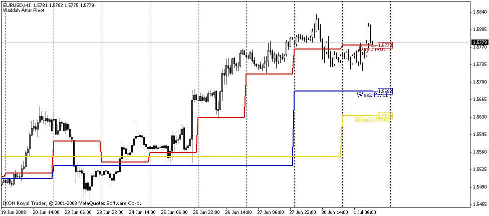
The Daily Pivot Points indicator is a powerful tool that helps traders gauge future market movements, setting itself apart from other indicators that tend to lag behind. This indicator utilizes data from the previous day to calculate key checkpoints for today’s minor trends. What are Pivot Points? The Pivot Point (PP) serves as the market’s equilibrium point—basically, a level that prices tend to gravitate towards throughout the day. By using three key values from the previous day—maximum, minimum, and close prices—traders can derive 13 levels for smaller timeframes: the equilibrium point, six resistance levels, and six support levels. These levels are what we call your checkpoints, making it easier to determine the direction of the minor trend. Among these values, the equilibrium point, Resistance1 (RES1.0), and Support1 (SUP1.0) are the most crucial. You’ll often notice price pauses, or even reversals, as it moves between these points. How Daily Pivot Points Work Forecast the range of price fluctuations. Identify potential price stopping points. Highlight possible points for a change in price direction. 
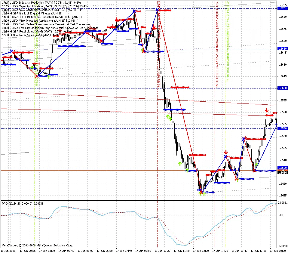
If the market opens above the equilibrium point, it’s a green light for long positions. Conversely, if it opens below, it’s a good day to consider short positions. The checkpoint method involves monitoring potential reversals or breakouts when the price hits resistance level RES1.0 or support level SUP1.0. As the price approaches RES2.0, RES3.0, or SUP2.0, SUP3.0, you’ll often find the market overbought or oversold, making these levels ideal exit points. The calculations for the Pivot Point (PP), Resistance1 (RES1.0), Resistance2 (RES2.0), Resistance3 (RES3.0), Support1 (SUP1.0), Support2 (SUP2.0), and Support3 (SUP3.0) are based on the previous day’s HIGH, LOW, and CLOSE values. This generates new values that map out potential future highs and lows. PP = (HIGH + LOW + CLOSE) / 3 RES1.0 = 2*PP - LOWRES2.0 = PP + (HIGH - LOW)RES3.0 = 2*PP + (HIGH - 2*LOW) SUP1.0 = 2*PP - HIGHSUP2.0 = PP - (HIGH - LOW)SUP3.0 = 2*PP - (2*HIGH - LOW) RES0.5 = (PP + RES1.0) / 2RES1.5 = (RES1.0 + RES2.0) / 2RES2.5 = (RES2.0 + RES3.0) / 2 SUP0.5 = (PP + SUP1.0) / 2SUP1.5 = (SUP1.0 + SUP2.0) / 2 Where: HIGH: The maximum price of the previous day. LOW: The minimum price of the previous day. CLOSE: The close price of the previous day. PP: The equilibrium point (the typical price from yesterday). RES and SUP: These are your checkpoints for resistance and support levels, respectively. Understanding how to effectively use Daily Pivot Points can seriously enhance your trading strategy. By keeping an eye on these levels, you can make more informed decisions and potentially improve your trading outcomes.

2008.06.29
Understanding Correlation Coefficient in Currency Trading
MetaTrader4
Understanding Correlation Coefficient in Currency Trading

Calculating the correlation coefficient between two currency pairs can be a game changer for traders. This nifty tool helps you understand the relationship between the price movements of different pairs, making it easier to strategize your trades. When using the correlation indicator, you're comparing the currency pair shown on your chart with another pair specified in the indicator's settings. Here's what you'll find displayed in the indicator's window: Correlation Coefficient Chart: This visual representation shows you how closely the two pairs are moving in relation to each other. You can choose to hide this chart if it's not your cup of tea. Moving Average of the Correlation: Another layer of insight, this moving average tracks the correlation over time, and like the correlation chart, you can toggle its visibility. Average Correlation Value: Here, you'll find the average correlation coefficient based on the specified number of recent bars. Mode Settings: You can select different modes to determine how the correlation is calculated: Mode 0: Uses the closing price of the bar. Mode 1: Calculates the difference between the opening and closing prices. Mode 2: Analyzes the relationship between the closing price and the maximum price of the bar. When setting up the indicator, you can specify: Pair: Enter the currency pair you want to analyze, like "USDCHF" or "EURUSD". ShowCorrelation: Set to true if you want the correlation buffer displayed, or false if not. ShowMA: Set to true to show the moving average buffer, or false to hide it. CorrelationRadius: Define the radius of correlation; the default is 15. MA_Period: This sets the period for the moving average, typically at 10. ResultingBars: Input the number of bars used to calculate the average correlation coefficient. If you set this to 0, it averages all available values. You can also customize the appearance of the average correlation value: FontName: Choose a font, like "Verdana". FontSize: Set your preferred font size, often 10 is standard. FontColor: Pick a color for the font, with black being a solid choice. Utilizing the correlation coefficient indicator can significantly enhance your trading strategy. By understanding how different currency pairs move in relation to one another, you can make more informed decisions and potentially boost your trading success.

2008.06.29
Introducing the TrendLineRange Indicator: A New Tool for Traders
MetaTrader4
Introducing the TrendLineRange Indicator: A New Tool for Traders

Hey fellow traders! I’m excited to share my very first indicator with you all—TrendLineRange! I know there are plenty of indicators out there, but I decided to create my own as a way to learn and dive deeper into trading. You've got to start somewhere, right? As a newbie myself in the Forex world—I kicked off my trading journey back in January 2008—I believe this indicator could be a real gem for those just starting out. So, what does this indicator do? Simply put, it sends out a signal (Alert) when the price gets close to the support/resistance lines at specified distances: 20, 10, and 5 points. These values are adjustable to fit your trading style. The beauty of it is that it won’t bombard you with alerts at every tick. Instead, it generates a signal when the price transitions from one range to another: 20 <= Price < 10 10 <= Price < 5 5 <= Price = 0 Plus, it conveniently shows the current distance from the price to the support/resistance line in the upper left corner—making it easy to keep track of where things stand. What’s included in the signal? Range: The distance from the current price to the support/resistance line. Price: The current price itself. TrendLine: The current position of the support/resistance line. Settings you need to configure: PointsRange1: The first (largest) distance to the trend line where a signal will be triggered. PointsRange2: The second (medium) distance for signal activation. PointsRange3: The third (smallest) distance for signals. IndexTrendLine: The exact index of the trend line you’ll find in your list of objects. Make sure to input the distances in decreasing order! I hope this description is clear—my goal is to make it as straightforward as possible for those of us who are still finding our way in trading. If you have any suggestions, ideas, or feedback, I’d love to hear from you! Drop me a line! Here’s a look at the indicator settings: List of objects: Signals:

2008.06.23
Understanding the Normalized Volume Oscillator for Better Trading Decisions
MetaTrader4
Understanding the Normalized Volume Oscillator for Better Trading Decisions

The Normalized Volume Oscillator is a powerful tool designed to help traders analyze market trends more effectively. This innovative indicator utilizes normalized volume data, which you can learn more about here. So, what’s the deal with normalized values? Well, they’re expressed as a percentage of the average volume over a specific period. This nifty feature allows the data displayed on your chart to dip into negative territory, indicating a potential lull in market activity. Another cool addition is the coloring of histogram bars based on the size of the normalized volume. Here’s the breakdown: Blue: Current volume is below the average for this period. Dark Green: Volume slightly exceeds the average. Light Green: Volume increase surpasses the Fibonacci level of 38.2% compared to the average. Yellow: Volume exceeds the Fibonacci level of 61.8% compared to the average. White: (shown as red in the image below) indicates that volume has exceeded the Fibonacci level of 100% compared to the average. Normalized Volume Oscillator In the example above, you can see how the Normalized Volume Oscillator can be utilized to assess the likelihood of breaking through pivot levels. The yellow histogram bar suggests a strong potential for a breakout in the near future, while the white (red in the image) bar signals that a breakout is currently happening and is likely to succeed. This indicator tends to shine on shorter timeframes, like the 15-minute chart. When analyzing longer trends, the conditions for breakouts can be a bit dulled since the overall volume level is higher. In such cases, a simple green histogram bar is enough to indicate potential movement.

2008.06.21
First Previous 363 364 365 366 367 368 369 370 371 372 373 Next Last