Author: Tim Welch
If you’ve been trading with the default candlesticks in MetaTrader 4, you might be missing a crucial piece of the puzzle. These basic candlesticks come with a significant flaw: they don’t display the Ask price, nor do they save it in the historical data. This can lead to some nasty surprises, especially if your broker averages the Bid and Ask data. I know a broker that does this, and I’m sure there are others out there.
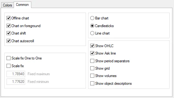
In MetaTrader 4, candlestick calculations rely solely on Bid data. To glimpse the current Ask price, you need to check the “Show Ask line” option in the chart settings. Seeing the Ask price is vital when you’re placing your Stop Loss orders.
To get a clear picture using a live chart, I suggest you open a 1-minute chart. Here’s how:
- Open a blank chart.
- Access the chart properties.
- Change the chart style to candlesticks.
- Ensure you have the “Show ASK lines” option activated.

You’ll notice a red line appear on your chart. Keep an eye on this red line; it won’t affect the formation of candlesticks until someone buys at the Ask price.
This Ask price is crucial for determining your Stop Loss. If you see the Ask price consistently hovering above (or, during times of increased spread, significantly above) historical prices, you can place your Stop Loss more effectively when entering a new trade.
So, how can you fix this? Unfortunately, there’s no way to adjust past data since the historical charts only save Bid data. However, there is a solution for live charts, and that’s where WelchCandlesticks_v2 comes into play.
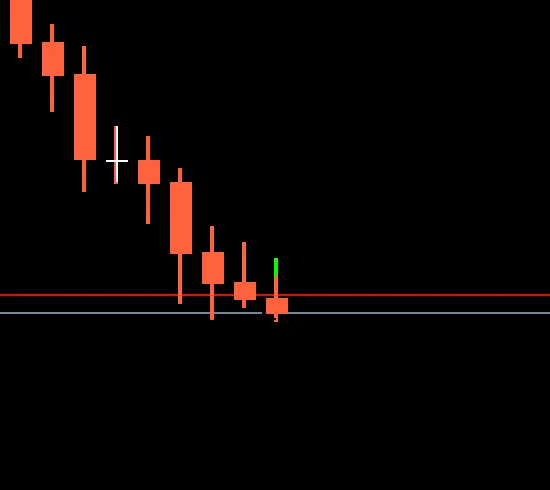
Adding this indicator to your chart allows it to create new candlesticks that incorporate spread data into the wicks. It won’t affect the Open, Close, or Low values, only the High. (The Bid is always the Low, which is why I often found myself getting stopped out of my Sell trades. The market would reverse, and the spread would spike, catching me off guard before I could react.) This tool visually represents when I got knocked out of trades, helping me understand the market dynamics better.
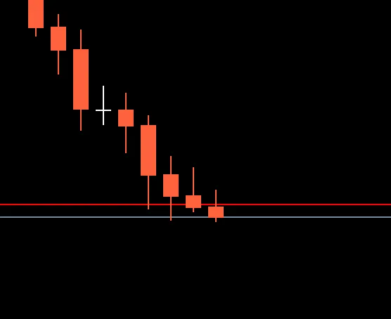
Take a look at the two charts below: one features standard candlesticks, while the other showcases my modified candlesticks. You should easily spot the lime lines, marking where the spread exceeded what the candlestick High would have indicated.
This example is from AUDJPY on August 25, 2014:


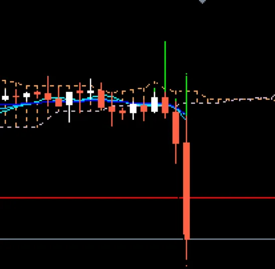
And here’s another chart showing a massive spread spike just before the price took another dive:

I’ve been using WelchCandlesticks_v2 for a few years now, and it’s given me a noticeable edge in my trading. It’s not a magic solution that will rain money overnight, and it won’t guarantee profits. But it definitely helps you visually track when your broker alters the spread, allowing you to place your stops more accurately. This way, you can avoid getting stopped out just when the market seems ready to make a significant move in your favor. Happy trading! :-)
Related Posts
- Unlocking MetaCOT 2: Your Ultimate CFTC Indicator Toolkit for MT4
- Unlocking the Power of Master Tools for MetaTrader 4
- Mastering the MACD Candle Indicator for MetaTrader 4
- Mastering TrendLineAlert_V2: Your Go-To Indicator for MetaTrader 5
- Mastering SL+TP-CP Pip Distance Indicator v2 for MetaTrader 4
