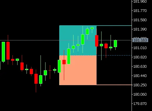
Ever wished you could easily spot premium and discount zones on your trading charts? Well, you're in luck! This handy indicator highlights the premium and discount zones of a single candle from any higher timeframe you choose. With just a few clicks, you can select the candle you want to analyze—be it the current one or a previous one—using the CandleOffset feature. The indicator will automatically fetch the candle’s high, low, and midpoint.
Here’s how it visually breaks it down:
Premium Zone (Upper 50%)
This is represented by a shaded rectangle that stretches from the candle’s midpoint to high.
Discount Zone (Lower 50%)
This zone is marked by a shaded rectangle extending from the low to midpoint.
High / Mid / Low Lines
Optionally, you can add horizontal lines that indicate the candle’s high, mid, and low points, which can be extended to the right for easy reference.
User Inputs That Give You Control:
The timeframe of the candle (like D1, H4, W1)
Which candle to showcase (CandleOffset)
Whether to display just the rectangles, the lines, or both
Customize the colors for rectangles and lines, as well as the line style
Choose if you want the lines to extend to the right side of your chart


Comments 0