What is the Acceleration and Speed Indicator?
The concept behind the Acceleration and Speed Indicator is straightforward. It’s surprising that we haven’t seen more indicators like this in the market!
How It Works
In trading, prices are always in motion—climbing higher or dipping lower. By analyzing a set number of bars over a specific timeframe, we can determine the difference between closing prices at the beginning and end of that period. This difference gives us the speed of price change during that timeframe.
Once we establish the speed, we can easily figure out the acceleration.
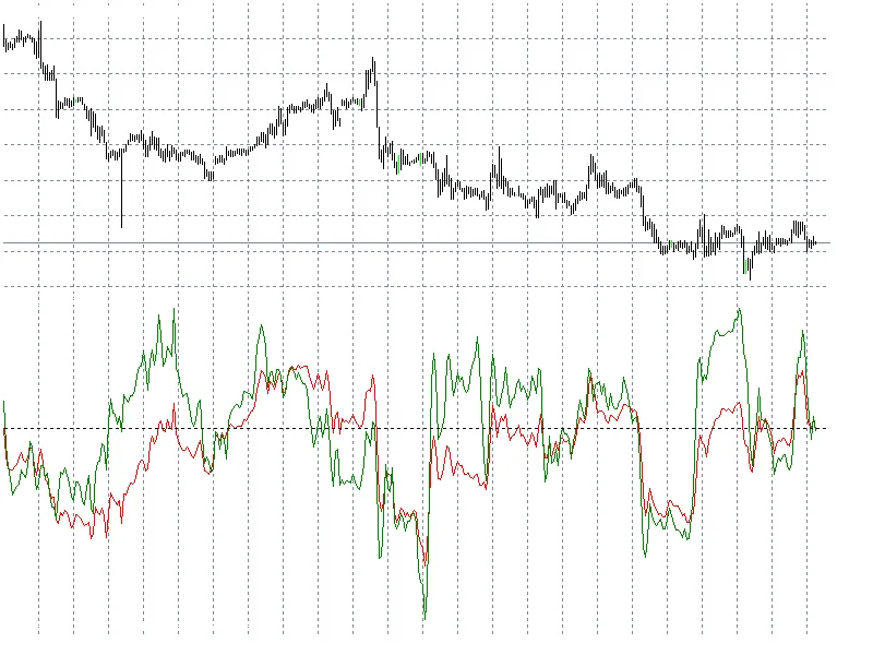
Interpreting the Indicator
In the image above, the red line represents speed, while the green line indicates acceleration. Both are measured in points.
Now, what can we take away from this visual?
- Boundary Values: Speed has upper and lower limits.
- Cyclic Nature: The indicator displays a cyclic behavior over time.
- Directionality: Speed and acceleration don’t always align; they can move in opposite directions.
Latest Enhancements
I’ve made a few tweaks to improve usability: I added separate speed charts (in yellow) and acceleration charts (in blue) with a historical shift. Plus, there’s a handy visibility switcher for the charts!
These modifications should help you analyze market movements more effectively. Happy trading!


Comments 0